
 |
| Elsie de Wolfe's leopard print bathroom. Oil Painting by Julian la Trobe, c. 1990 |
The project went smoothly, except when it came to one fabric; the leopard print. I was proposing it be used as piping on the comforter, the reverse of the pillows, as a pleated bed skirt; nothing major. It was a very small pattern as well, done with a cream ground and green spots. The reaction I got was somewhere between horror and disbelief. The reaction I gave in return was much the same. We did not butt heads or go to war, but as she anxiously wondered what sort of leopard clad Indo-Bordello I had in mind for her bedroom, I wondered what sort of Leopard clad Indo-Bordello could have scarred her in such a way.
Personally, I believe Leopard, and all other Animal prints for that matter, to be 'neutrals'. Now, I usually loathe anything 'neutral', at least in the way people have been encouraged to think of them. It's color castration. Color wheel androgyny. Wholly lacking in dedication or commitment to any point of view. These opinions have been formed because I have seen 'neutrals' done horribly, usually at the suggestion of some person with a television show who thinks painting you house beige will help you sell it, despite the fact the house is a rat hole next to a freeway on ramp. But I digress.
 |
| Leopard Carpeting from Ralph Lauren. A witty contrast to the Georgian style interior. |
As I said, leopard is a neutral. Think about it. It's essentially nature's camouflage. How much more neutral can you get than blending in with your surrounding? We've been using leopard for centuries, from Egypt through Elsie de Wolfe. It's part of our collective history and remains one of the most timeless elements in design. It's at once outrageously elegant and subversively edgy. It's at home in a Beaux Arts mansion and a SoHo Loft. It's our best friend that loves us unconditionally. So, don't leave this cake out in the rain.
In the end, she yielded to my suggestion after some deliberation. Here's why it worked. First, it was a good foil for the other fabrics in the room; namely a green faille, a buttery chenille, and a large exotic floral print. Second, though it was an animal print, it's small scale and subtle pattern made it a compliment, rather than a screaming eyesore. Third, the quality of both the fabric and the print was very good. Cheap fabric will always look cheap, no matter what you do to it. The printed cotton I chose hung beautifully and the color was perfect. There was also the proviso that if she absolutely hated it, I would replace it at my expense. I'm sure that helped ease the pill down.
- Ian
 |
| Elsie de Wolfe's Sunroom at the Villa Trianon. A leopard settee and rug, plus mirrored walls. Mirrored walls need to make a comeback. |
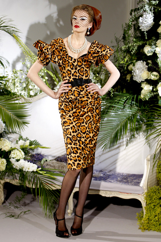 |
| Some leopard Couture from Dior, for good measure. Fall 2010. |
@ian: someone's been reading his Town & Country. xo-catherine
ReplyDeleteMais oui. I blew through those few pages of Leopard decadence in seconds.
ReplyDeleteIan