Thursday, March 31, 2011

The Venetian Wars

I'm not going to lie.  I used to hate Venetian mirrors.  Actually, I still sort of do hate them.  A lot.  It's really a knee jerk reaction rooted in experiences had during my formative years.  I've always believed that we are emotionally scared by our personal histories, and I think inanimate objects can hold just as much psychological napalm as human beings. 

The tackiest Venetian mirror I could find does not do
justice to my distaste.  This one is a humdinger though...
tri fold, clunky pieces, no delicacy to the etching. 
And that room it's reflecting is a conucopia of awful. 
A color in a restaurant, while beautiful to 99.9% of the population, can send you into a spiral of anxiety, outwardly channeled through carbo-loading, because it was the same color as your Mother's dining room in Great Neck, and you haven't come to terms with your deep seated resentment of her or her Bunko group.  Or maybe your Parochial School uniform was plaid, and because various evil children made your life hell while enrolled in Our Lady of Eternal Torment, all plaid is now verboten in your home because it's associated with adolescent torture and an unflattering fit.

Keeping those deep emotional barbs in mind, I have been scared by Venetian mirrors.  The root of my disdain was originally foggy, but then I came to understand that it wasn't the mirror that caused me grief, but the misuse of them.  Because my exposure to them was not done in a curated environment conducive to appreciation but rather horror, I came to believe that all Venetian mirrors were gauche, hideous, over the top monstrosities that never should have made it beyond the East River.  They belonged in pseudo 'French' interiors; porcelain figure lamps with fringed and pleated shades, swagged window treatments, damask wallpaper, dusty silk plants...the makings of nightmares.  But really, it wasn't the mirrors fault, it was the owners.  It was they who should have never made it past the East River as penance for their tacky transgressions.

This pair of antique mirrors consumed the original budget
for the entire room.  Instead of eliminating the mirrors,
 Taylor advised that the client 'get more money'.
So here's what, or who, changed my mind on the Venetian matter; Michael Taylor.  The late San Francisco Decorator used Venetian mirrors so much so that they became signature pieces.  Almost always antique, preferably in pairs.  What made the mirrors work so well, and this is a testament to Taylor's eye as a Decorator, was that the rooms were consistently calm; nothing screamed for attention.  You were never smacked in the face with sensory overload, as is common with today's 'Look at me!' Decorators.  Another Taylor signature was his desire to reduce the amount of 'stuff' other Decorators crammed into rooms.  This helped make unique stand alone pieces, such as his Venetian mirrors, stand out without shouting.  They really become a subtle foil to his contemporary proportions and profiles.  The viewer can come to appreciate the craft and artistry that goes into the mirrors, rather than just be overwhelmed by them.

My Venetian wounds are starting to scab over.  I now have an appreciation for these massive 'look at' me pieces.  Their beginnings in Murano (an Island off Venice that glass production was moved to during the 13th Century out of the fear that the furnaces would burn the wooden Republic of Venice to the ground), their distinctly Baroque profiles, their glitter for the sake of glamour.  I like them looking like they've been around the block a few times; give me worn eroded silvering, a little rattle when they hit the wall, perfection shows a lack of character.  Just don't approach me with the cheap stuff; I might regress and start carbo-loading.
 - Ian

An authentic 18th Century Venetian Glass mirror.
Auctioned at Christie's for $96,748.00
Imagine if it were one of a pair!
And I'm in love with the patina.

A howler of a mirror.  Compared to one of quality,
this one is clumsily done, obviously mass produced,
and cheap.  All good reasons for a person to swear off them. 

A 1965 Syrie Maugham bedroom by Michael Taylor.
Note how the Mirror commands, but doesn't overpower.
I love the simplicity of the Fireplace, and the quiet walls.
I'm also mad about that Tree Fern in the corner.


Tuesday, March 29, 2011

Darling, I Barely Recognized You...

I did not take this incredible photo.  I wish I had.
This is probably the best way to view the
Light Sculpture on Wilshire.
All credit goes to Michael Grobe Photography.
http://www.grobe-bilder.com/
I used to know LACMA like the back of my hand.  Years spent as an Art History student meant frequent visits and a resulting familiarity with the institution.  Asian Art in the Basement, Rome and Egypt on 2, American Art and Furniture on 1, India and Costumes on 3.  True, it wasn't the Met, or the Whitney, or the Frick, and at the time The Getty Villa was closed and the Getty Center was still under construction, but it was still home, and it had endeared itself to me and many others.  Looking back, it was the first destination that drug me out of my suburban safety net and into the 'big city', if you will.

Much has happened on the LA art scene since graduating more years ago than I care to remember.  The Getty Malibu reopened, the Getty Brentwood finally opened, (I'm glad to say I'm a frequent patron of both), and some guy named Michael Govan took over LACMA, to much fanfare.  The hope was that, finally, LA would have a namesake Museum on par with those in other Cosmopolitan cities across the US.  It takes a while to climb a mountain that big, but I think LA is well on it's way.  Govan has certainly done his part to put LA on the map; enviable exhibitions, donor/patron driven building projects, and educational outreach.
Tony Smith's'Smoke' fills the atrium with it's now
uncovered original skylight.
 With all the dust being stirred up from construction, I had hung back and not paid a visit.  Initially, there was to be a Renzo Piano overhaul, calling for the demolition and reconstruction of the entire Museum.  While it horrified me (what some called disharmonious and out of date, I called charming), my unrest was not in vain; funding never materialized and the job was shelved.  Since then, they have completed the Broad and the Resnick galleries (both design by Piano), as well as a brilliant subterranean parking structure.  I say brilliant because in LA, parking is everything.  And, they are currently putting the finishing touches on a new Cafe (also designed by Piano.  I think they're trying to compensate...) which will be added to the dining roster with the Pentimento Restaurant and the family friendly Cafeteria.


The former Roman gallery, with windows open to Wilshire.
 I found myself there a few months ago, with a good friend who's wonderful company on Museum excursions, though he knows more than he lets on.  It was a rainy Saturday and what better way to spend it that at a Museum. 

When I entered, I was first blown away by the fact that they had finally (FINALLY) torn off the shredded tarps from the original skylight in the Ahmanson building, and took the Atrium back to it's 1960's International Style Travertine clad glamour.  For years I had lamented being able to see the blue tarps flapping in the wind while standing inside; it was so tacky and low rent.  Thankfully, those days are gone.  The wood paneled Elevators and brass mounted clocks were also still in tact.  The other major architectural favor they did for the building was to open up the windows onto Wilshire Blvd.  All the years I trudged through the dimly lit rooms, I never suspected there were windows hidden behind false walls, but there were.  Beautiful, floor to ceiling windows that let in glorious natural light.  Light is of course the enemy of painting and textiles, but it's not of sculpture.  These room now house less environmentally sensitive art.

Another surprise laid in the reorganization of the Art in the Museum.  Galleries had changed floors, or buildings, periods had been combined to wonderful results, and rooms had been reconfigured to allow for better traffic flow and new ways to view the art.  Though this was not a bright, shiny, modern master by Piano, to this native, it was a brand new experience.  I didn't have enough time to see everything, and for the first time in a long time, that what I wanted to do.  I wanted to get to know my old friend all over again, and I think with time, I will.   

- Ian


The Sculpture Garden on Wilshire, seen though the Ground Floor windows.


A table I j'adore.  Dare I say it's precious?
I am enamored with the little Turtle feet.


Refreshingly, quite a bit of the art is hung Salon style, an old
trend  that I am happy to see come back into the public eye.


A dramatic display of Bronze Sculpture.


The Art of Being Well Hung

Nothing wounds me more than a home without art.  I am not an art expert, by any means.  I know my history and I know what makes me go tingly all over, but I am in no way an afficianado or remotely highbrow.  Will this stop me form lambasting someones choice?  No, it won't.  But I will always maintain that art is one of the most personal things in your home and what ever you decide to hang on the wall is truly a refection of you.  That being said, if you invested in some Damian Hirst lately, you may want to seek counseling.  And if you splurged on any Thomas Kinkade, you may want to put your money in a trust, to prevent any more questionable spending.

Despite having a strong horizontal line, this arrangement of
'art' looks more like a stamp collection skidmark.  It actually
makes the faux wood paneling look stylish.  I could go on for
days with this room, but for now, lets just focus on the art.

If you are one who is fortunate enough to have filled your life with art, please, for the love of all that is holy, do not go around your house with a hammer and a mayonaise jar full of rusty nails and perforate your walls at random.  There is nothing worse that a sad little piece of art on a huge wall, or a mixed lot random ends forced into submission by a maniac with a hammer.

I always live with a piece for a few days before I hang it.  I move it around, see which wall gets the best light or is the right size, or see what room the piece looks best in.  I also love to hang pieces in groups; artwork can be clustered by subject matter or medium (landscape oils, black and white photos, etc) or even just frame finish (antique gold, metal, wood tone, etc).  The objective is to make an interesting display that is unified and compliments the room and the art.  Don't just slap something on the wall and call it a day.  This is supposed to be something you love, so treat it accordingly.


I recently did an art installation for a client, and amazingly, had the forethought to take photos of the process.  I'm not going to lie, planning it all took twice as long as just swinging a hammer and a whispered prayer, but the end result yielded no remorse, which made it all worthwhile.

- Ian


Step 1: Assess the space to be filled. 
Mine was a staircase wall; tall and expansive.
Note: A collection of art works much better than one
single piece, as the collection can be added to and
manipluated to fit any odd areas.

Step 2: Assess the art.
Lay art out on the floor in a configuration you think
could work.  My common theme is engravings, btw.
Note: Take photos of the winning layout, because you
won't remember when it comes time to hang.
This layout is good.

This layout, not so good.  Kind of boring, too square.

Step 3: Lay it out on the wall.
I made newspaper cut outs the size of each piece of art
and then taped them to the wall to see what it would
really look like.  This way, I can get the spacing right
the first time around, and I can shift the layout around if
it doesn't feel right.

Step 5: Install.
This group has already been added to with
other little treasures we've found along the way.
That's what's so great about an asymmetrical
group like this.  Lots of room for new friends.

Tuesday, March 22, 2011

HE SAID SHE SAID: Working 9 to 5?

Welcome to our new series, "He Said She Said". The idea behind it is simple: One of us will pick a topic, write about it, and the other will write the dissent (or trash talk).

For our first topic I have climbed out of the kiddie pool and selected The House of Chloe. Fashion, while I simply j'adore, is not my forte--though I did spend countless Saturday mornings in the early 90's watching Style with Elsa Klensch... However fashion is a religion of Ian's so this should be interesting.

While perusing the NYTimes' online slide shows of the NYC Fashion Week for Fall 2011 I stumbled upon Chloe's Fall line. Oh, no. No, no, no, no, no. Someones been playing with Doc Brown's Delorean again.  Was 1985 that great? With each click of the mouse I couldn't understand the motivation behind making women go back to the days of working 9 to 5 (however great of a movie that was). Drawing upon other generations for inspiration is one thing. Recycling Ralph Lauren -minus the turquoise accoutrement, is another. And, doesn't the third style remind anyone of Tess McGill? Hmm.

Well, it turns out that I was not looking at Chloe's Fall 2011 line but archived images of their Fall 2010 line (yes, 2010 does seem like ages ago, doesn't it?) My bad. I'll skip the wine the next time I do "research" for this blog.

To be fair, Chloe's Fall 2011 line has far more creativity and pizazz. There's a yellow, blue & red vertical striped skirt I must must must  have. (Way to bring back your A-game Hannah MacGibbon) Still, the 2010 line -one or two pieces notwithstanding, left me stumped.

I immediately turned to the one person I could count on, Ian. Surely a man with his seemingly limitless knowledge of cuffs, pleats and shoulder pads could explain what went so wrong. It was like a very special episode of Blossom.  However his reply to my rant was short and not-so-sweet: "I must disagree with you". Gobsmacked. Sir, your Ralph Lauren predilection might explain why you once tried to style me as a 60 year-old upper-east-side lady who lunches...but it doesn't explain your love of this, um, stuff.  What am I missing? I'm not kidding -if I get McQueen & L'Wren, why don't I get this?  And why did I give away my emerald green suit? The pleats really hid the bad stuff.

-Catherine


Before I really begin, I think we need to go over a few fashion truths that are self evident.   Specifically, unless you are rail thin and taller than 5'-9", pleats will never work for you.  Nor will tapered leg trousers, harem pants, cropped lengths of any kind, or high waists.  And while we're on it, you should only wear skinny jeans if 'skinny' is a word that has been used to describe your physique.  If you dare to wear them and you are not skinny, your lower half will look like two clotted pastry bags begging for sweet relief.

As for the collection, I rather liked it.  Yes it was a throwback, but Chloe's heyday was the more optimistic late 70's early 80's, bows and all; I think MacGibbon is referencing archival pieces to reinvigorate a brand recognition and encourage nostalgia for better days.  Despite it being familiar, it was filled with classic investment pieces that shoppers in a recession are more apt to purchase and not feel guilty about.  Who doesn't ultimately want the perfect cashmere coat?  Those wide leg pants were some of the most beautiful I have seen, and when paired with a monochrome sweater or even the beaded twin set at the end, you could wear those looks until they bury you. 

Yes, the collection was a little Tess McGill and Jane Fonda, but I also saw some pieces reminiscent of 70's era Jackie O, Lauren Hutton, and Angelica Huston.  What woman still doesn't want to look like those icons?
Ironically, I loved the jumpsuits.  The knit one with the harem pant finish was witty, especially with the knit cape and frilled collar, and the nude draped jersey number at the end of the show was very elegant.  Despite the risk you run when using a public restroom while wearing one, jumpsuits are universally flattering.  An uninterrupted column gives a slimming effect and finishing the silhouette with a pant rather than a skirt, makes you appear taller. 

Regardless of our feelings, here is the truth.  Fragrance and Handbags keep these fashion houses afloat.  Everyone wants a piece of this culture, but few can afford to really buy in.  That leaves millions buying $80.00 bottles of perfume, or thousands buying $2,000.00 handbags.  While not selling clothes, that's still quite a chunk of the world buying a brand.

As well, I think we can both agree that the real stars of the show are those Breck girl hair styles.  So much bounce and shine, but only their stylist knows for sure.  Truly, I'd love to see the return of the blowout and Velcro rollers, I'm sort of over the raggedy extension and rats nest cleverly referred to as 'bed head'.

- Ian  

Saturday, March 19, 2011

Would You Like Me to Seduce You?


I'm not really asking, mind you; it's come to the point now where it goes without saying.  That aside, when I recently read that the Getty in Brentwood would be hosting a major exhibition that recreates daily life in an 18th century Parisian Townhouse, those immortal words from The Graduate immediately came to mind.  When confronted with the sensory overload, who wouldn't want the hand of a more experienced lover to guide them?  The Lover, in this situation, is the Getty, and we are the wide eyed ingenues looking for an education not found in textbooks.  Bring on the butterfly kisses and the obsessive phone calls.  We're ready for love, Mrs. Robinson. 

The exhibit, which runs April through August, will be a significant experience for anyone enamored with French design.  It will be a curated collection of pieces loaned from other institutions; an assemblage of Furniture, Art, Accessories, Fashion, Jewels, Porcelains, Textiles and anything else that exemplifies the decadence and joie de vivre of the period.  I'm hoping for some suggestive engravings spotlit in a darkened room.  I can't wait to be wooed by a well turned leg, as long as it has a gilt bronze mount.

File:Fragonard - swing.jpg
Fragonard's The Swing
Lovers play in a secluded wood.  As the young
woman casts off her shoe, the young man
hidden in the hedge is granted a
view of the Loire Valley.
The Rococo style of the 18th Century is a favorite of mine.  It rejects the pomp of the Baroque, has a fluidity unseen in the Neo-Classic, and lacks the propaganda of the Empire.  I also find the influences from the English during this period to be very amusing.  The French certainly did not find inspiration in the English style as a whole (and even if they did, they'd never admit it) but I do think they saw something worthwhile in the way the English presented and entertained themselves; there was an air of formality, but also a sense of whimsy that at the time, the French were without.  They were especially fond the English's love of the outdoors and found the pastoral life novel and very appealing.  

At this time, the English Garden style was being refined and defined, and the French took to the idea of the 'natural landscape', which under the careful eye of the Landscape Designer, would be manipulated to provide the optimal view from a given vantage point (rip out a tree, build a waterfall, move a hill).  This was quite a contrast to the formality of French gardens during the Baroque.  The French would absorb elements of the naturalistic English garden, as well as thematic ideas like flirtatious milkmaids and randy shepherds frolicking in the countryside, and turn them into romantic, or naughty, tableaux painted for the amusement of the French court (see Fragonard's The Swing).

File:Boucher Marquise de Pompadour 1756.jpg
Madame de Pompadour sits in elegant repose
for her favorite painter, Francois Boucher.
 The Rococo era was very much about the loosening of societal restraints for the French.  The previous Baroque style was deeply rooted in formality and artifice and ruled with an iron fist by the very serious Louis XIV.  The new Rococo was about comfort, sensuality, and intimacy.  One of the great trendsetters of the youthful Rococo was Madame de Pompadour, Mistress, confidante, and advisor to Louis XV until her death at the relatively young age of 43. 

Not one to just set the fashion, she was a major patron of the arts (sponsoring Painter, Poets, and Writers) and a well educated woman who could bend the ear of the most important politicos.  She was also very shrewd; she guaranteed her position of power by introducing Louis to secondary Mistresses (he had quite the carnal appetite, and there's only so much one woman can take) who were never quite as clever or beautiful or charismatic as she was, but were still suitable stand-ins.  You could say she was adept at the art of job security.
-Ian


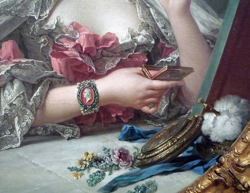
Boucher paints Pompadour during her Toilette.
The Rococo period ushered in a new feeling of intimacy. 
Clad in a dressing gown, her body language is informal; it's as
if she were about to tell us a secret in the privacy of her boudoir.


The Cameo bracelet not only reflects the fashion, but also
shows a subtle tribute to her lover, Louis XV.  The casual
placement of accouterments indicates that we have caught
her during a more private moment.


File:Fragonard - Blind man's bluff game.jpg
The Blind Man's Bluff, by Fragonard. 
A young farm boy and girl (dressed in Taffeta work clothes)
play amidst a rustic country setting.  Pure fantasy. 
 

For the Love of Leopard


Elsie de Wolfe's leopard print bathroom.
Oil Painting by Julian la Trobe, c. 1990
 Ages ago, when I was a baby Decorator, my first project was a Master Bedroom for some wonderful clients that I'm glad to say, I still have.  My brief was to do British West Indies; so I found a stunning four poster bed with Banana Leaf carvings, had raised paneling installed with a chair rail, and threw in a ceiling fan with Palm frond blades for good measure.  Suddenly, it's A Passage to India and I'm waiting for Judy Davis to get out of the shower so we can watch a Polo match and judge people unfairly based on their socioeconomic status. 

The project went smoothly, except when it came to one fabric; the leopard print.  I was proposing it be used as piping on the comforter, the reverse of the pillows, as a pleated bed skirt; nothing major.  It was a very small pattern as well, done with a cream ground and green spots.  The reaction I got was somewhere between horror and disbelief.  The reaction I gave in return was much the same.  We did not butt heads or go to war, but as she anxiously wondered what sort of leopard clad Indo-Bordello I had in mind for her bedroom, I wondered what sort of Leopard clad Indo-Bordello could have scarred her in such a way. 

Leopard Carpeting from Ralph Lauren.
A witty contrast to the Georgian style interior.
Personally, I believe Leopard, and all other Animal prints for that matter, to be 'neutrals'.  Now, I usually loathe anything 'neutral', at least in the way people have been encouraged to think of them.  It's color castration.  Color wheel androgyny.  Wholly lacking in dedication or commitment to any point of view.  These opinions have been formed because I have seen 'neutrals' done horribly, usually at the suggestion of some person with a television show who thinks painting you house beige will help you sell it, despite the fact the house is a rat hole next to a freeway on ramp.  But I digress.

 As I said, leopard is a neutral.  Think about it.  It's essentially nature's camouflage.  How much more neutral can you get than blending in with your surrounding?  We've been using leopard for centuries, from Egypt through Elsie de Wolfe.  It's part of our collective history and remains one of the most timeless elements in design.  It's at once outrageously elegant and subversively edgy.  It's at home in a Beaux Arts mansion and a SoHo Loft.  It's our best friend that loves us unconditionally.  So, don't leave this cake out in the rain.

In the end, she yielded to my suggestion after some deliberation.  Here's why it worked.  First, it was a good foil for the other fabrics in the room; namely a green faille, a buttery chenille, and a large exotic floral print.  Second, though it was an animal print, it's small scale and subtle pattern made it a compliment, rather than a screaming eyesore.  Third, the quality of both the fabric and the print was very good.  Cheap fabric will always look cheap, no matter what you do to it.  The printed cotton I chose hung beautifully and the color was perfect.  There was also the proviso that if she absolutely hated it, I would replace it at my expense.  I'm sure that helped ease the pill down. 
- Ian 


Elsie de Wolfe's Sunroom at the Villa Trianon.
A leopard settee and rug, plus mirrored walls.
Mirrored walls need to make a comeback.

 
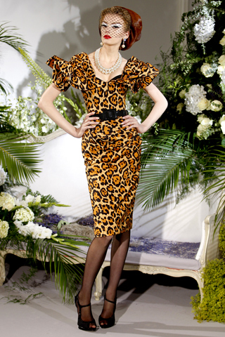
Some leopard Couture from Dior, for good measure.
Fall 2010.


Friday, March 18, 2011

Ah! Mr. Anderson...

Untitled, 2010
I don't really know how to describe the work of British painter Hurvin Anderson without sounding trite, pedestrian -or worse: like a teenage wannabe groupie at a Bieber concert.  Let's just say my first word upon viewing his paintings was, "wow".  Not a sharp, short, "wow" but rather a long drawn-out "wow" wherein I lost myself and traveled from the present to the far recess of my subconscious, lingering in the bliss of serene memory and mood.  At first glance I was reminded of Hopper. These paintings are haunting, silent -yet loaded with narrative.  And I don't think it needs to be said that I simply j'adore. (See? This is why I don't write for Art in America.)

Some People (Welcome Series) 2004
Vicky Lowry of Elle Decor writes, "...[Anderson] usually starts with a photograph which serves as a trigger for memory... and the ideas he wants to explore... including his sense of place in the world as a black man living in England and as an Englishman visiting the Islands." Whether creating a series dealing with a barbershop in his childhood hometown of Birmingham, England (Peter's Series) or illustrating the social complexities of Trinidad (Welcome Series), Mr. Anderson draws us into his world --which we immediately make our own.

Afrosheen (Peter's Series), 2009


I wanted to linger in this world of his creation a bit more. I only wish I could hang one of his paintings on my wall. 

If you would like to see more of what I j'adore take a peek at the Thomas Dane Gallery and the Saatchi Gallery. And if you see my husband would you remind him that I have a birthday coming up?

-Catherine

hat tip: ElleDecor April, 2011 ART SHOW: Hurvin Anderson by Vicky Lowry.

Thursday, March 17, 2011

A Chair by Any Other Name

I had just finished dinner with friends in Santa Monica and we decided to walk off our over-indulgent meal with a trip down the 3rd Street Promenade.  The shops had just closed, so it was window shopping all the way, and that was just fine.  I was feeling fat and didn't want to send myself into a tailspin of emotional instability in Banana Republic. 

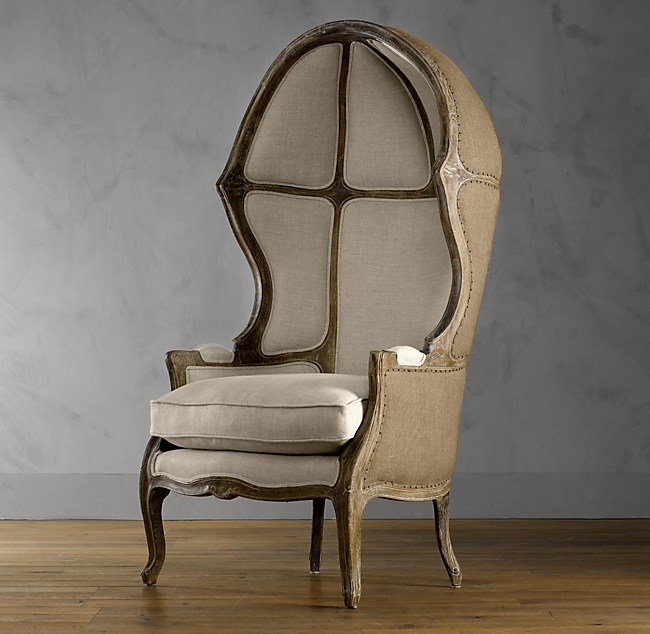
Versailles Domed Burlap-Backed Chair
The Versailles Domed Chair at Restoration Hardware.
Inspired, but ultimately drab in pickled wood and Burlap.
I do give RH credit for being unique.
We passed in front of Restoration Hardware and one of my companions asked me what sort of chair was in the window.  An innocent question, but for the first time, I really didn't know.  I usually know obscure minutia, but this time I was left out in the cold. 

I had seen this sort of chair dozens of times before, usually in those over the top rooms no one could ever live in, but were nice to visit.  The chair was svelte, with cabriole legs and closed arms.  The back ascended higher than a wing back chair would have, and ended in a dome shape at the top.  Quickly, I said it was a Balloon Chair, and ushered us away to another window.

After I recovered from my shame, I found out I was correct in my assessment based name.  But I also discovered a plethora of other nomenclatures, put forth to confuse anyone who actually wants to find out the name of this flipping chair.  In addition to being dubbed a Balloon Chair, it is also known as a Porter Chair, a Dome Chair, a Canopy Chair and a Hooded Chair.  I'm almost certain there are a number of other terms for the chair, all equally obscure, that will still get you now where when trying to describe or purchase one of these suckers. 

 
Canopy Chairs in the Dining Room
of the Bergdorf Goodman
Restaurant.
As I mentioned, these little numbers have been popping up all over the place.  When Bergdorf Goodman reopened their Restaurant, after a redecoration by Kelly Wearstler, they were used as dining chairs.  While I think that's lovely and dynamaic, it's not terribly convenient to drag one the these things up to a dining table.  The wind resistance alone would require a spotter.

For those interested, the origins of the canopied chair dates back to Ancient Rome.  The wealthy elite would be carried though the streets in what is commonly known as a Sedan Chair, an enclosed portable structure with a bench seat used for transport; powered by men, not horses.  Think of a port-a-potty on rails carried by two strapping guys (one in front, one on back) and you get the idea.  This idea evolved, the Sedans becoming more elaborate, I feel they reached their crescendo in the 18th Century, which is also when they seemed to die off.

The Porter's Chair
A Practical, if plain,
Porter Chair.
As for the name 'Porter Chair', it's derived from the occupation of the chairs original occupant.  As the story goes, this sort of chair would be used by a Porter or Doorman who would be stationed at the Entry or Gatehouse of an Estate (we're going back to the English Renaissance for this one).  The homes were so large that even if there were a doorbell, no one would be able to hear it or get to it in time, hence, the Porter. 

The canopy and sides would keep out the draft while also keeping in whatever heat the Porter was able to generate as he waited for visitors.  Often, there would be a little flip out shelf to hold a lantern.  The original Porter chairs were very understated and simple; they were for the help, after all. 

To compensate for this simplicity, I have taken the liberty of including some not so simple examples of this marvelous, if not hard to pin down, chair.

-  Ian


I'm enamored with this style of chair done in Cane.
So very unique.  I don't even mind the orange.

An exotic departure in Bamboo.  So Indochine.

Porter's Chairs New York
A more English version, with Button Tufting, Nail Head,
Chippendale style legs, and audacious Zebra upholstery. 
I want these.  Now.

For the Love of La-Z-Boy

When I was pregnant it was recommend that I obtain a glider. Have you seen them? Gliders?  The poor little things look like they've been hit too many times with the ugly stick.  My reply: "No thank you. I'm going to judge this book by it's cover and go with something that doesn't look like it needs to be paired with a wallpaper border."  So I registered for an Eames Rocker @ Design Within (Somebody's Else's) Reach.

Well, flash forward a few months. I've got a beautiful, healthy baby boy and a whole lotta sleep deprivation. When Peanut was 3 months old, my husband and I took him on his first road trip to the wedding of good friends in Paso Robles. We opted to stay at the lovely retro Best Western. I'm guessing the last room renovation took place around the time JR and Sue Ellen were still going strong.  As I entered our room my eyes fell upon a La-Z-Boy.  The snickering! The guffaws! That all ended when I climbed into this bad boy at 3:00am. Oh sweet baby Jesus. I have never, ever been more comfortable in such ugliness in all my life. It was glorious -like being hugged by a soft, large, fuzzy teddy bear. Image to the right is a pretty darn actual representation but without the cigarette burns.

Back to present day. My lovely Eames Rocker, while a classic beauty, is comfortable if and only if you do NOT have a 16-pound wiggling object in your lap desperate and cranky for liquid gold. To remedy my discomfort, I switched to our small Danish mid-century chair for the multiple nightly feedings. Like a lover desperately clinging to a doomed relationship I tried to ignore my feelings of disappointment & dissatisfaction. Admitting there were drawbacks to Danish furniture would be tantamount to putting french doors on an Eichler.

Maybe there is something to form following function. Maybe. So I started fantasizing. My thoughts turned to a chair with actual, practical comfort, built-in cup holders and even side pockets for magazines and extra burp cloths... Now I am on the hunt for something that doesn't make me weep with sorrow to look at yet cuddles me & my Peanut like Saarinen's Womb Chair (at a fraction of the cost). The search is daunting. I feel like John Wayne roaming through Seven Fingers. Google it.

-Catherine
not awful:  Luca by Land of Nod     |     Cole by NurseryWorks

Wednesday, March 16, 2011

For the 21st Century Raja

To follow up on an earlier post about the Duquette jewelry auction happening at Bonham's on Sunset, I am presenting you with a selection of items going under the hammer.  In my modest opinion, these are the 5 most beautiful pieces, ones that would justify cat fights, name calling, and mildly violent physical contact.

What I find wonderful about these is that none of them are ludicrously expensive, considering their pedigree and their material content.  For the faint of heart & pocketbook, who still want a piece of the action, there were some $300.00 braided gold cuffs, and a few $500.00 quartz torsade necklaces, all of which were beautiful and eye-catching.  You can view the full catalog at http://www.bonhams.com/.

I also love that these are pieces you won't be afraid to wear; you don't have to worry about a diamond popping off in an elevator or losing a pave stone in the car.  As well, statement pieces like these could not be more in style right now.  They're all so very editorial, and could be worn with anything; a de la Renta suit by day, Gottex by the pool, Marchesa by night.  Think of them as an investment in pride and envy, but in the best possible way.

- Ian

For a larger view, click on the image.  All photos and descriptions courtesy of Bonham's.


A blue topaz, kunzite, moonstone, colored pearl and vermeil necklace
signed Tony Duquette
length 20in (50.8cm)
Estimate: $1,800 - 2,500 


'Symbolizing Adventure and The Eternal Journey', early 1990s
A carved bone, coral, carnelian, silver and vermeil necklace, signed Tony Duquette
with original box
length 19in (48.2cm)
Estimate: $3,000 - 5,000 


'Symbolizing Wealth in All Matters, Spiritual Strength, Integrity and Love and the Past, Present and Future Nature of Material Strength', 1990s
An amethyst bead, paua shell and vermeil 'fan leaf panel' collar
with original box
length 23in (58.5cm)
Estimate: $2,500 - 3,500 


'Symbolizing Birth, Death and Rebirth', 1990s
An amethyst, peridot, amber, cultured pearl, rose quartz, black coral and vermeil necklace
with original box
length 21 1/2in (54.5cm)
Estimate: $3,000 - 4,000 


'Symbolizes the Beauty Found in Nature', 1990s
An amethyst, inlaid shell, quartz, plastic and vermeil necklace
signed Tony Duquette 1995
length 24in (61cm)
Estimate: $1,500 - 2,000